Branding
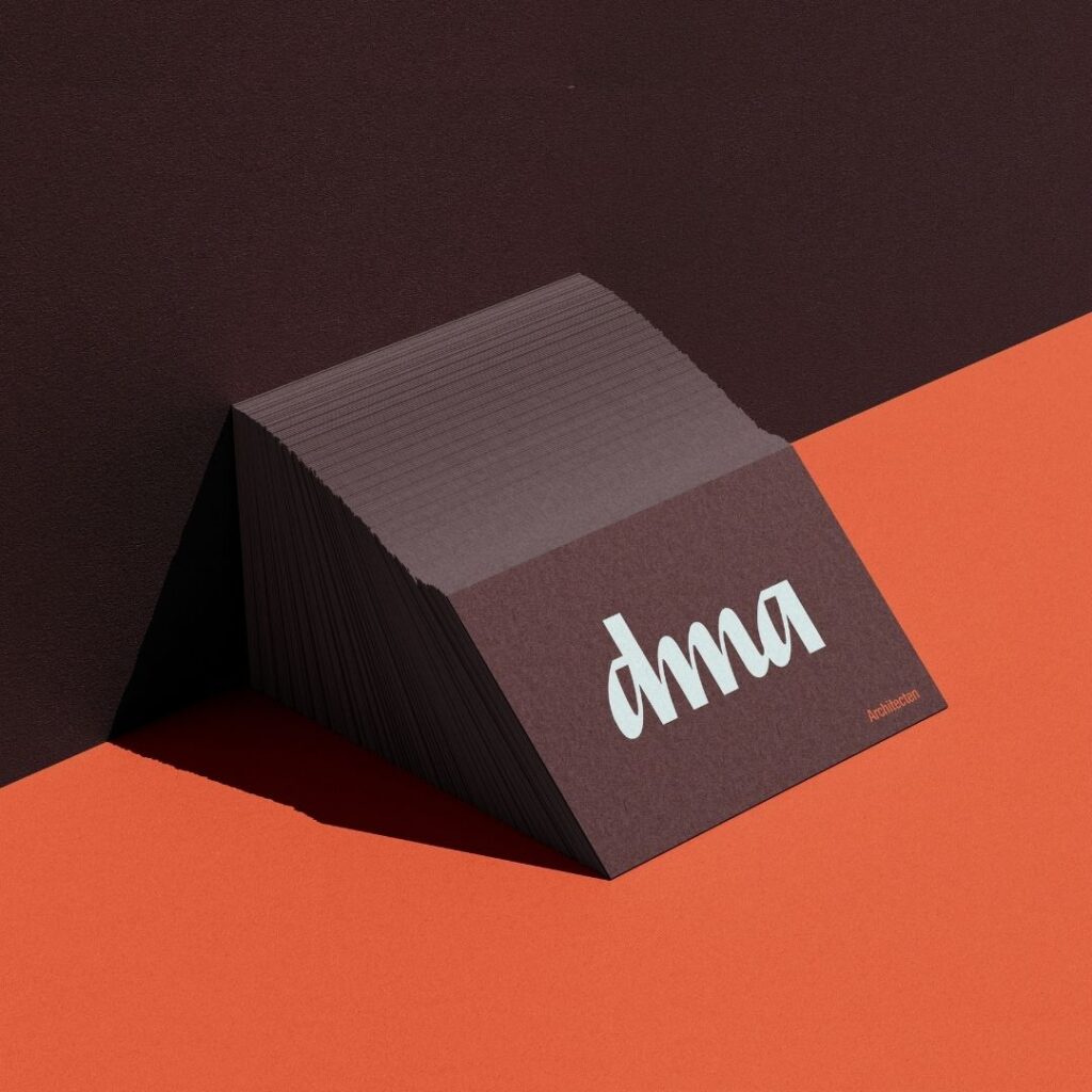
We were entrusted with the full rebranding of David Meeus Architecten (DMA), an Antwerp-based architecture studio shaped
by a mix of Belgian brutalism and contemporary playfulness. Before designing anything, we studied what was already out there, from construction site banners to logos.
We took these insights and created an identity designed to build trust, feel clean and considered, a little playful, but most importantly, blend beautifully into every space in which it appears.
Social media management
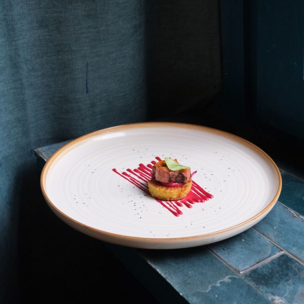
Refined eclectic fine dining meets playful creativity and hands-on craftsmanship.
For La Beurre, the culinary concept by chef Jannis Moons, we create and manage social media content that captures both sides of the brand. From beautifully plated dishes to the messy, hard labor behind them.
Our approach combines food photography, storytelling and a distinctive visual identity to build an authentic social media presence.
Branding
For La-Beurre, we created a bold identity that captures contrast: the energy of the kitchen versus the serenity of the dining room. Eclectic, unapologetic, and full of flavour. ensures that every project reflects his commitment to making interiors both visually appealing and highly functional.
The branding was built around a single idea: butter. Naturally, butter yellow became a core brand color, grounding the identity in something tactile and warm. The name Le Beurre was chosen by founder Jannis Moons himself. A playful nod to butter, intentionally bending the correct French (which would be “le beurre” with the proper article) into something more direct and memorable, paying homage to the hard labour behind the craft.
Rebranding
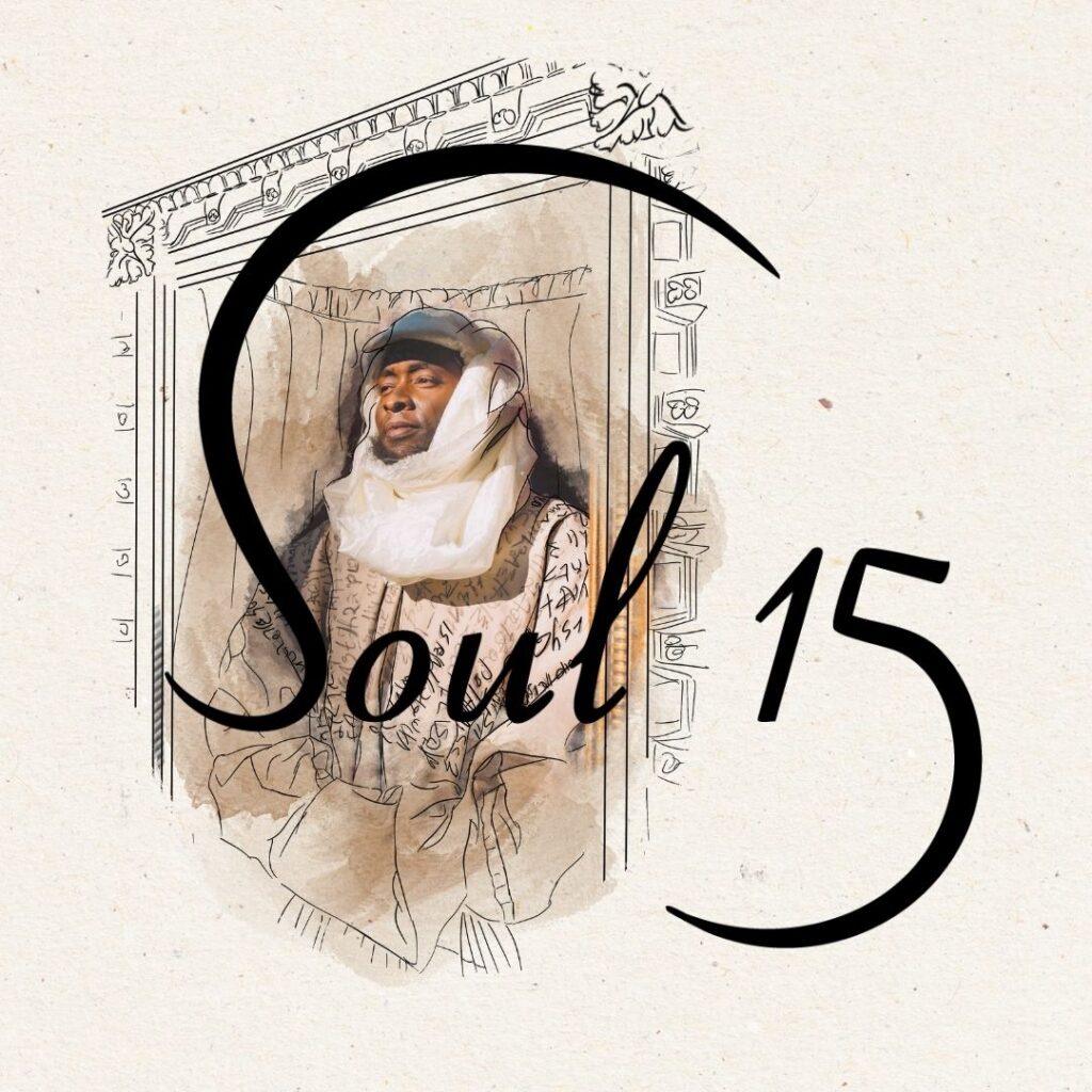
Soul15 brings imagination to life through world-class performing arts and bespoke costume design.
Their visual identity needed to reflect the magical worlds they create. With every project starting from a blank canvas and evolving into an extraordinary, surreal experience, this creative process became the foundation of our approach.
Soul15 already had a strong offline presence. The strategy was translating that strength online, without losing what made it distinctive. Photography does the heavy lifting: the work speaks for itself, instantly recognizable, no logo needed.
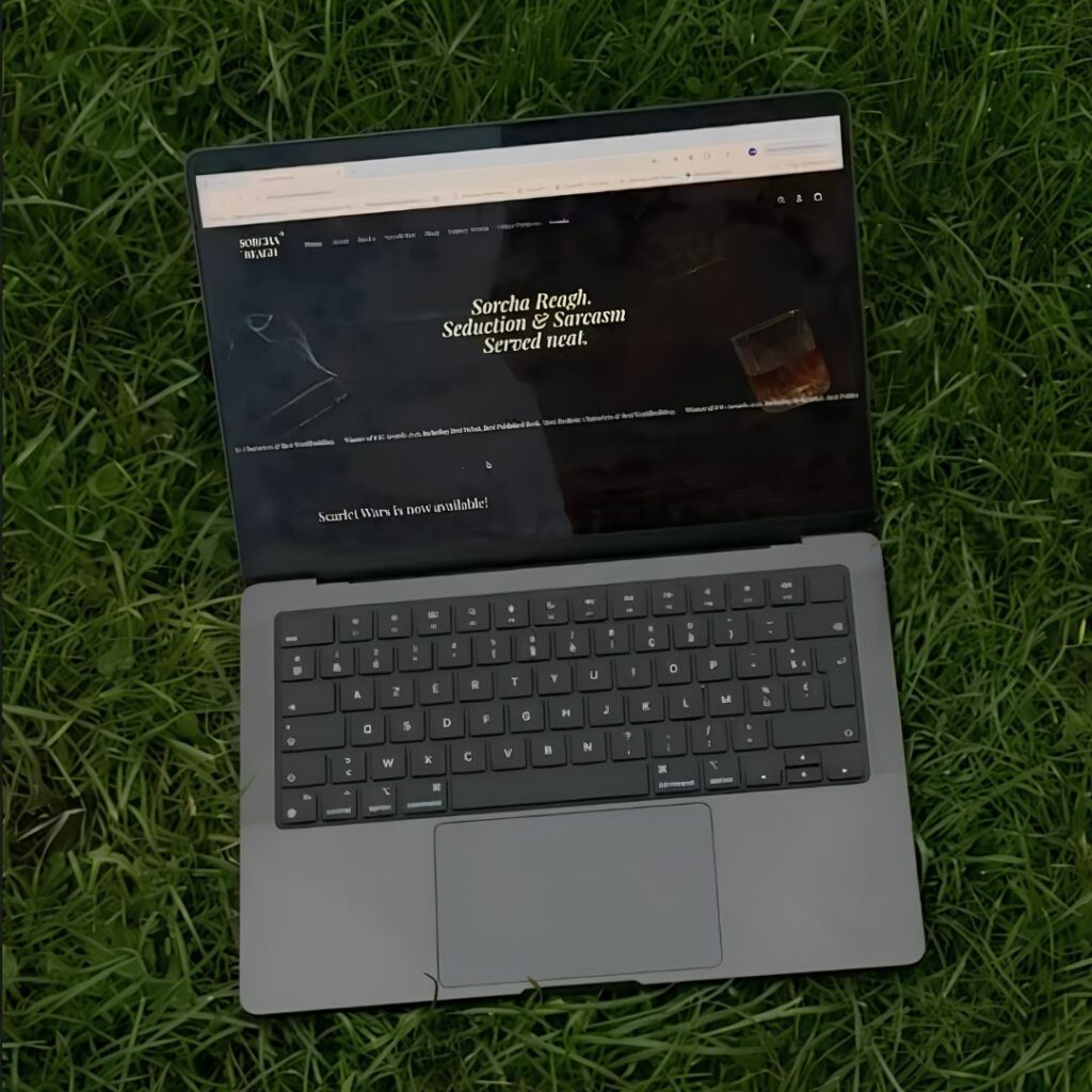
Shopify website
Seduction & sarcasm, served neat. 🥃
Sorcha Reagh describes herself as a romantasy author creating worlds where magic, desire and deeply questionable moral choices collide.
Don’t know Sorcha Reagh yet?
If you’re into slow-burn romance, sharp sarcasm, morally grey characters and deeply questionable moral choices, she’s definitely your kind of read. 📚
Our challenge?
Translating that world into a digital bookshop that feels unmistakably hers.
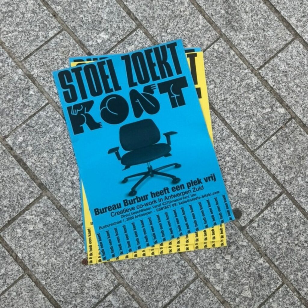
Poster action
A simple but strategic poster campaign designed to attract new coworkers to Bureau Burbur, a creative coworking space in Antwerp.
The brief? Create a low-budget, high-impact activation that stands out in the streets.
Our approach: bold typography, eye-catching colours, a playful hook and good old-fashioned tear-off tabs. Proof that effective offline marketing doesn’t have to be complicated or expensive. Sometimes, a clever concept and a piece of flashy paper are all you need to get noticed.

Logo Design
Step into Tiemen Didden’s Antwerp-based interior design realm, where practicality meets aesthetics. His designs effortlessly merge functionality with style, creating spaces that are as beautiful as they are livable. Didden’s approach ensures that every project reflects his commitment to making interiors both visually appealing and highly functional.
A simple and super classy logo was asked and delivered!
PS: Tiemen if you read this, I still want one of those gorgeous branded sweaters!

Social Media
Social media is a powerful tool for osteopathy practices to connect with potential patients, educate the public about holistic health, and build trust through transparent, informative content. A soft and personal image on these platforms humanizes the practice, transforming it from a clinical service to a compassionate journey that potential patients can relate to emotionally.

Branding and Merch
The visual identity of NOTTI is built around our core values: minimalism, playfulness, and warmth. Every visual element from photography to layout is designed to foster a welcoming atmosphere that feels approachable and authentic.
Our imagery serves not only to inspire but to connect. It reflects the essence of our brand style while resonating with the everyday lives and values of our community. Through a careful balance of simplicity and character, NOTTI invites people into a world that is both aesthetically refined and emotionally engaging.

Poster Design
There’s a warmth and texture in paper that the digital world just can’t replicate and we embrace it, every step of the way.
From the soft grain under your fingertips to the quiet rustle of a turned page, paper brings presence into the moment.
It’s not just about print , it’s about creating something you can truly hold on to.

Logo Design
Imagery and visual language are essential elements in building a strong brand presence. For allee.be, the unique challenge lies in creating a visual system that allows for a diverse range of visual styles to coexist while maintaining a coherent and controlled overall look and feel.
The branding system especially the logo plays a crucial unifying role. It acts as a visual anchor, tying together collaborations with brands that may differ significantly in tone and style. The examples below illustrate how the logo consistently creates cohesion across three completely distinct brand expressions.


